
a r t o b i
Overview
Artobi is an independent jewelry brand I created from the ground up. The goal was to build a clear, recognizable identity that could grow with the business and work across both physical and digital touchpoints.
As founder and creative director, I developed the brand strategy and visual identity, then applied them across the logo, color palette, packaging, website, product photography, and art direction.
Scope
Brand Strategy
Visual Identity
Website Design
Packaging Design
Art Direction & Photoshoot Production
Pop-up Experience Design

"Sweet, Flirty, and Colorful"
a r t o b i

a r t o b i
Brand Strategy
Artobi.Shop is for people who treat jewelry as a form of self-expression and play. I wanted the brand to feel colorful and fun without feeling childish, so I built it around one simple idea: jewelry as a little treat.
Website & Art Direction
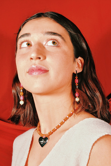
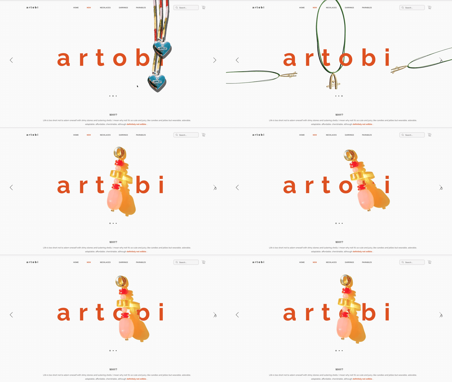
I designed and built Artobi’s website, starting with the feeling I wanted it to capture: sweet, flirty, and playful. I created a visual moodboard to explore how that personality could show up across the site, then used motion to bring the pieces to life and make the experience feel playful rather than static.
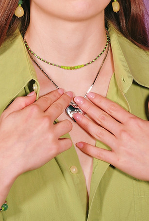
Photography was a big part of making that direction work. I planned and art-directed the shoot, took and edited the photos, and used bold lighting and bright colors to bring out the energy of the brand. Rounded typefaces helped carry that same sense of playfulness throughout the rest of the website.


Primary Logo
Artobi’s primary logo pairs overlapping rings with two stars, balancing sweeping curves with sharp points. I designed it to give the brand a recognizable presence across packaging, the website, and in-person experiences.
.png)
Artobi’s original logo was an “A,” but when I made it into a pendant, people questioned whether they could wear it if their name didn’t start with A. I reshaped the letter into an oval ring, keeping the ring and star details so it still felt connected to the original design without being tied to an initial.

.jpg)


Packaging
Instead of a standard square jewelry box, I designed a round box that feels more connected to Artobi’s curved logo and jewelry. The outside is pink with a yellow-rimmed lid and a small wordmark, while the orange interior adds another layer of color when the box is opened. Together, the three colors carry Artobi’s identity through the full unboxing experience.
POP UP ACTIVATION
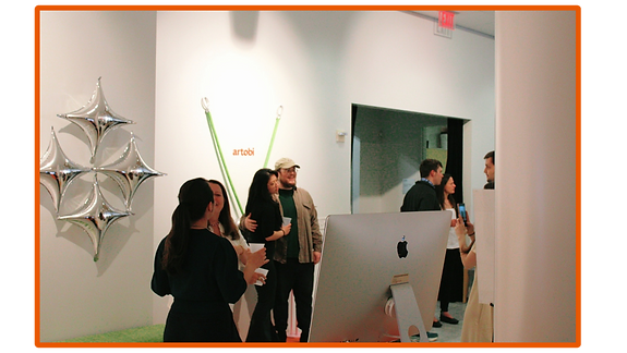
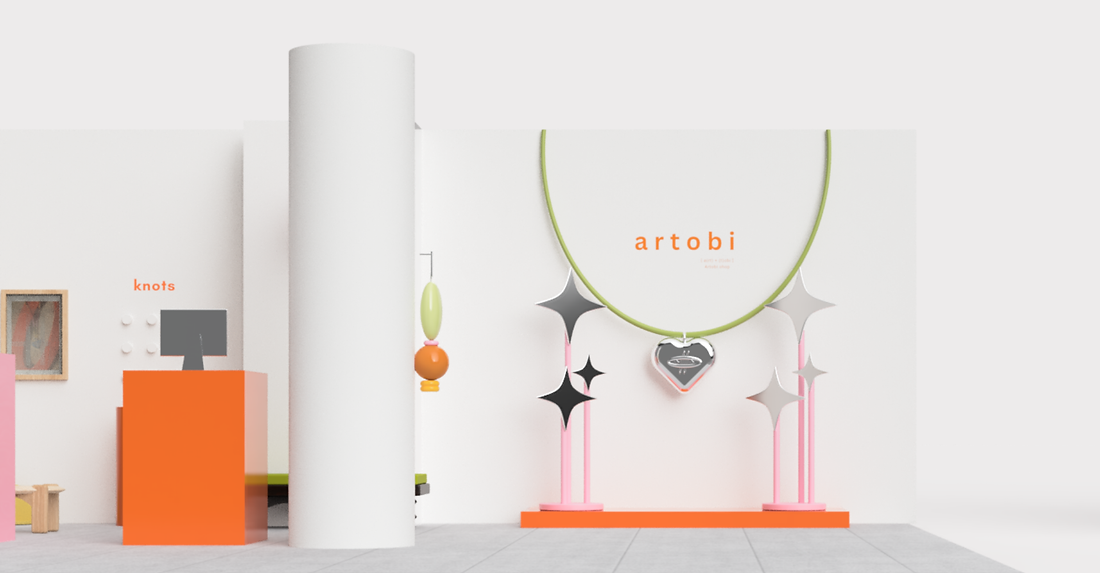
I designed the gallery pop-up to feel like stepping into Artobi, bringing the brand’s colors and shapes into the space. I rendered the setup in Fusion 360 and fabricated the props myself.
_edited.png)


Planning the Pop-Up
Before building anything, I recreated the gallery in Fusion 360 to plan how Artobi would live in the space. The renders helped me test the layout, colors, product displays, and custom props before moving into fabrication and installation.
.png)
