
Overview
UCI (Unit Check-In) is a checkpoint at the end of a unit on Duolingo that assesses how well learners understand what they’ve learned. It gives learners feedback on their progress and helps us understand how well the material is sticking.
During a UCI, learners work through a quick set of flashcards, mainly answering by speaking. This checks how well they understand the unit’s material before moving on. Unlike regular lessons, learners must get enough answers correct to pass.

Path Node

Session Start

Flashcards
Session End Stat

Project Objective
UCI (Unit Check-In) launched with a simple visual direction designed to test the experience. Once the experiment proved successful, we wanted to give UCI its own identity and make it feel like a bigger milestone for learners
.
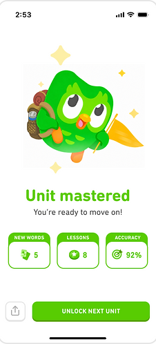
My role was to develop UCI’s branding and make the experience easier to use. This included updating the path nodes, session start screen and session-end screens to make pass/fail results clear and celebrate higher scores, progress within a unit, and moving into the next. Even when learners didn’t pass, we wanted their improvements to feel rewarding.
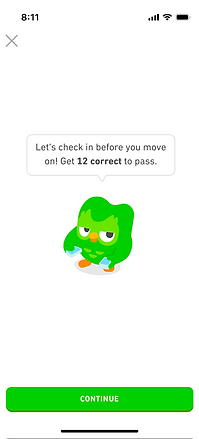
Emphasized passing, with little context on what was being reviewed.
Breakdown:

Path Node
Session Start
UCI didn’t stand out as a learning milestone.

Flashcards
Session End Stat
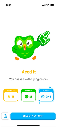
Highlighted stats, with little celebration of unit completion.
Needed a stronger celebration of completing the unit.

Pass

Fail
Didn’t show learners their progress so far or recognize score improvements.
Explorations
I explored the balance between making UCI feel significant and keeping it approachable so that we don’t deter learners from starting. This meant considering the visuals, highlighting key stats, celebrating unit completion, and exploring how the tone of the copy should shift between a first attempt, a pass, and a retry state.
1


Guiding question: How can we celebrate unit completion and showcase the progress a learner has made throughout the unit?
Exploration: Delight is a big part of how we design at Duolingo. I explored a new session-end screen to showcase all the words a learner has learned in the unit. The words would appear as tokens, with Duo shooting up into the air in a big celebration.
2

Guiding question: How can we make UCI stand out as a learning milestone while making it clear that learners must pass the checkpoint to continue?
Exploration: The current UCI node doesn’t feel like a milestone or make it clear that learners need to pass before moving on. To address both, I explored a “Checkpoint” concept inspired by reaching a new point on a hike, giving learners a moment to see how far they’ve come before continuing their journey.
3



Guiding question: How can we highlight key stats to celebrate learners’ progress at the end of a unit?
Exploration: UCI presented learners’ stats much like a regular lesson, which I felt didn’t reflect the milestone of completing a unit. I explored ways to gamify the stats reveal and worked with an animator to turn my motion frames into an animated sketch.
I worked with an animator to bring my motion concept to life.
Final Result
Over three weeks, I explored several directions for UCI across the path nodes, session-start screen, and session-end screens. The strongest direction framed each UCI as part of a hiking journey, with Duo guiding learners from one unit checkpoint to the next.
The updated experience made pass and fail outcomes easier to understand while celebrating higher scores, progress within a unit, and moving into the next one. I also refined the copy along side a cop-writer to set clearer expectations and help learners understand what to do next.

Path Node

Session Start

Flashcards

Session End Stat

Pass

Retry
Takeaways
Although the project was paused when the Duolingo Score team began redesigning lesson-end screens across the app, it gave me the opportunity to explore the role visual branding plays within a larger product. Even within an established brand like Duolingo, individual features need their own visual language to stand out and feel recognizable.